
![]()

Fascination! Newsletter, Issue #7 Wallpaper is not something that immediately springs to mind when one thinks of Cirque du Soleil. But that hasn't stopped Seabrook Wallcoverings, Inc. from creating wallcovering designs "mystic and unique, inspired by the movements and grace of the human body" under the name of Cirque du Soleil. Well, that's not really the total truth. Seabook only distributes the Cirque book, they didn't create or manufacture it. The credit actually goes to a Toronto Canada firm, Blue Mountain Wallcovering, who employed a designer who goes under the moniker of Tzaddi!, Llc. ("Tzaddi" actually means "fish hook" in Hebrew, and is an important term in Tantric yoga, being the path leading between the second (Ego/Territorial) and the fourth (Sexual) brain circuits. For what it's worth. Anyway...) This was just one revelation from a recent conversation with Mr. Pierre Cousineau (pronounced Coo-zee-no), Vice President of Distribution for Montreal, Quebec, Canada's Beauport Wallcovering Company. We were very surprised to learn that there was a previous edition of Cirque wallcovering designs. And that the idea didn't come from Cirque in-house. But even more surprising was Mr. Cousineau's explanation of how the wallcovering book(s) came to be! THE STORY The story actually starts in Montreal (Cirques' "home town"), on a wintery evening during the 1994 Christmas season. Mr. Cousineau was working for Ontario wallcovering producer International Wallpaper at the time. While on a walk one evening he happened to notice a Cirque pamphlet advertising a local engagement of "Saltimbanco." With its bright colors and strong visual design sense, it caught his attention. "I wish I had a wallpaper book with that sense of design," he thought. At the time, after its '94 Tokyo tour and prior to its '95 European tour, Cirque had rented a local warehouse where it set up "Saltimbanco" to play for the Christmas season. (This is also a new revelation, as such an engagement has never been listed in Cirque's tour histories.) It was after seeing the show with it's grand design and spectacle that Mr. Cousineau was convinced the power of the imagery could be translated into wallcovering form. The following Monday he was on the phone to Cirque's home offices, who referred him to a New York agency. But he had to fight the battle on two fronts. Not only was Cirque unsure about whether their imagery could be translated to a wall, no one at International Wallcovering wanted to take on the design task. So he contacted a free-lance designer who had done other wallcovering books for him - Ms. Vicki Butler, who designs under the name Tzaddi! LLC. Intrigued by his idea, the Philadelphia-based designer met Mr. Cousineau for a New York City performance of "Alegría" in the Spring of 1995. That was all it took - Ms. Butler was inspired to come up with several initial designs. They were designed to be unique and upscale. "They had to be very different," comments Mr. Cousineau. "If not Cirque wouldn't have approved the concept." But by late Spring of 1996, after months of Mr. Cousineau trying to get an appointment to present the initial designs, Cirque still wasn't sure. As he learned later, there was a meeting at Cirque headquarters at which the topic of wallcovering was brought up. For long moments, no one at the meeting spoke. Finally a woman at the table suggested, "He's been bugging us for six months, let him come and show us some designs. What can it hurt?" Mr. Cousineau made an appointment almost immediately and presented the drawings, but the final OK rested with company founder Guy Laliberté, who was out of town at the time. So Mr. Cousineau left Cirque headquarters not knowing if his ideas would fly or not. The day Mr. Laliberté returned, the drawings were spread out on a table in his office. For 10 minutes he carefully examined them without speaking, "which is a world record" according to Mr. Cousineau's contact. Finally Mr. Laliberté broke his silence. "These guys understand." Mr. Laliberté grasped what Ms. Butler and Mr. Cousineau were trying to accomplish, taking the emotions and color and energy of Cirque du Soleil and translating them in graphic terms to wallcovering. He could "see the concept," said Mr. Cousineau, "and if they like the concept they let you go." The next two years they were "tortured by the direction, struggling" with the assignment. Slowly, the initial drawings were turned into bold, original, full-color finished designs, different from "regular" wallpaper. The International Wallcovering book was distributed in June, 1998 and was discontinued in June of 2001. (Wallcoverings generally have a shelf life of two to three years because as, Mr. Cousineau says, "tastes change.") The book was successful but took awhile to catch on. "Vicki's books do better the second year than the first," he suggests, "because her designs are somewhat ahead of their time. It takes the public a bit of time to catch up to her." One interesting story Mr. Cousineau tells about his attempts to get the book into designers' hands involves Hollywood. Normally, wallcovering books are just sent to the designers at the various studios (who keep copies in their design libraries) with little fanfare - a "non event." But Mr. Cousineau had a different plan, to make more of an "event" out of the Cirque wallpaper, showcasing Ms. Butlers' unique designs. So he sent one of the books to a distributor friend in Los Angeles, Mr. Aaron Kirsch, who facilitated set designers at the Hollywood studios. "Just do me a favor," Mr. Cousineau requested. "Tell them there's this weirdo who wants to fly all the way down from Montreal just to show them a book of wallpaper from Cirque du Soleil. If you don't get any appointments, fine." By the next day, Mr. Kirsch had appointments with nearly all of the people he called! The wallcovering later appeared on the sets of "Friends," "Mad About You," "3rd Rock From The Sun," and "The Nanny" to name a few. Later on Mr. Cousineau switched companies, becoming Vice President of Distribution for Beauport Wallcovering. But he took his relationship with Cirque with him, and suggested another book of designs be created to be produced by his new company. Vicki Butler was again the designer, and in June, 2001 the "Cirque du Soleil Collection Volume A: A Fantastic Journey" book was sent to 6,500 decorators, designers and retailers by American distributor Seabrook Wallcoverings (www.seabrookwallcoverings.com) immediately after the previous book was discontinued. The new designs are also making inroads into Hollywood, having just been extensively incorporated into the Casino set for the NBC daytime drama "Days of our Lives." And Mr. Cousineau is still working hard to get the idea of Cirque wallpaper out to the public. One idea he'd like to see is having the wallpaper books sent to local papers in cities where Cirque appears. Perhaps then more people will become aware of this fascinating product of Cirque du Soleil. BOOK 1 This first book, entitled "Cirque du Soleil: A Feast of Colors and Passions" was published in June 1998 under the Vintage First Edition Collections banner by The International Group Ltd., with the wallcoverings distributed by Decorlux in Canada and Brewster Wallcoverings in the USA. (UPC # for the book 7-73391-01592-1). The papers were available until June 2001. As with the current book the stuff was pricey, available in rolls 20.3" wide by 23.8 feet total and retailed for between USD $34-38. Five-yard-long borders sold for between $32-36 per roll. Fabrics were also available, with a yard of the 54" wide fabric selling for $50.00. The cover is a montage of images. While the Cirque name and logo mark are at the top in yellow, the main image is that of the ceiling of the Mystčre stage. Surrounding it are images from the four shows represented within - Mystčre, Saltimbanco, Alegría, and Quidam. There are eight "series" or "groups" of designs in the book, two for each of the four shows. Each series has between 3 and 8 sets of "coordinates" each (a coordinate is two or more wallpapers that coordinate with each other in color or design). While its impossible to properly convey what the designs look like, here's a quick summary: MYSTERE, ACT I - 6 coordinates - Here is a tribute to Cirque acrobats, as trapeze and Chinese pole artists are depicted on the borders and wallpaper. In addition to hearts and stars, the words "Cirque du Soleil", "Mystčre du temps", and "les artists" are scribbled throughout. The designs are presented in shades of red, green, blue green, and ivory. MYSTERE, ACT II - 4 coordinates - Evocative of the Las Vegas desert, these earth-colored papers contain no words, but have hieroglyphics and images of Mystčre characters perched on rocky landscapes. The papers come in brown, gray, light blue and rust red. SALTIMBANCO, ACT I - 5 coordinates - This would look great in a breakfast room. While not containing Cirque-specific images, it does have images of flowers, fleur de lis and sun-like circles. It is presented in yellow, green, and two very striking sets in vivid reds and yellows, and vivid blues and greens. SALTIMBANCO, ACT II - 8 coordinates - Childish and playful, with scribbled hearts and designs and caricatures of the silver and black-caped character. The words "Ego!" and "Cirque du Soleil" make an appearance, as do various letters. The paper is in tones of yellow and blue. ALEGRIA, ACT I - 6 coordinates - The flowery and fleur de lis-based designs of Saltimbanco Act I make another appearance here. Interestingly, the borders are die cut and very striking. Presented in blue green, yellow and orange. ALEGRIA, ACT II - 3 coordinates - The same fleur de lis and flower designs as above, again with the striking die cut borders, but in deep blue and light orange. QUIDAM, ACT I - 3 coordinates - Reminiscent of theater curtains, with the banners looking like gathered top curtains, and the wallpaper having the vertical fold lines of closed curtains. Presented in yellow, blue, and red. QUIDAM, ACT II - 3 coordinates - Similar to the playful style of Saltimbanco Act II, this has images of a sun face, scribbling and lots of other writing. One of the phrases I can make out is "joy in the creative and artistic." Available in gray, brown, and blue. In these earlier designs the concepts are bold, colorful, using Cirque images and words very distinctly. In my opinion these designs are better than in the second volume. They break more new ground and are more striking than the newer book, which seems to evoke a Cirque feeling without as much direct reference. BOOK 2 The book "Cirque du Soleil Collection, Volume A; A Fantastic Journey" is distributed by Seabook to accounts and designers nationwide. I was able to find a copy in my local Home Depot in their "Contemporary" section. It's 250 pages (originally released June 2001, and available until approx. June 2003) are an interesting experiment in graphically presenting some of the feeling and emotions of Cirque. The front cover is impressive, a Cirque performer in full regalia, and proclaims enigmatically "spirit and body, shadow and light, between earth and sky I tumble, spinning arabesques, kaleidoscope fantasy." All of the samples inside are pre-pasted, washable, peelable paper-backed vinyl. The book is being marketed and promoted mostly to upscale designers, for use in homes of people who might have a bit more money to spend than, well, me. There are seven "series" or "groups" of designs in the book, with each series having between 4 and 7 sets of "coordinates" each (a coordinate is two or more wallpapers that coordinate with each other in color or design). While its impossible to properly convey what the designs look like, here's a quick summary: KINETIC - 8 coordinates - A mélange of lines with no real shapes or shadows. The words "Invoke" and "Provoke" are incorporated within. The paper comes in gold, green, or blue/gold. The picture on the introductory frontplate features performers from "O." FUSION - 4 coordinates - Done with Japanese-style brush strokes, with the strokes depicting human figures such as dancers and acrobats. The words "Fusion" and "Cirque", appear throughout. Very oriental looking. Available in silver/gold/white, dark green, gold, and dark red. FREEDOM - 5 coordinates - Swirling circular images. Available in orange, red/green, blue green, green/purple, and yellow/light green. TRANQUILITY - 5 coordinates - This has an aquatic feel, looking like light filtered through water. It has a thick wavy line zig-zagging through the pattern and borders. The frontplate picture also features performers from "O." Available in blue/green/gold, dark blue, and rust red. NOBLESSE - 7 coordinates - Has a cloud-like feel, with a tree-like squiggle throughout the pattern. The frontpiece features the Sprites from "Alegría." Available in red/purple, yellow/purple, and blue/rust red. WISDOM - 4 coordinates - Here is imagery reminiscent of cave paintings. The borders have leaping and posing character likenesses. The frontpiece features "Mystčre." Available in reddish brown and yellow gold. EUPHORIA - 5 coordinates - Features flower images, it has some small figures in the border, and in variations on the wallpaper itself. Available in blue/purple, green/gold and purple. You can see how my attempts at description can't possibly do the designs justice. Like Cirque itself, seeing them is the best way to appreciate this unique product. In addition to multiple colors of wallpaper and borders within each design, the designs also feature upholstery-style fabric! This way an entire room, including the furniture, can be coordinated together. As you might guess, this stuff doesn't come cheap. The wallpaper itself comes in rolls 27" wide by 9 yards long, covering 60 square feet, and with a list price of $68.00 per double roll (you can only buy them in sets of two rolls). The borders vary in width, but cost $34.00 for a 5-yard spool. The fabrics are 72% polyester, 28% cotton blends, 56" wide, and cost $50.00 per yard. Decidedly upscale. (Though the clerk at Home Depot told me that their sale price was, on average, half of the "list price" shown in the catalog. Hmm, that makes it a bit more affordable.) SAMPLES 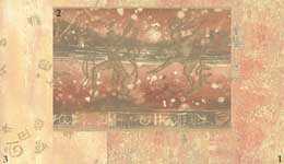 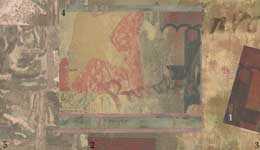 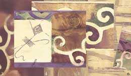 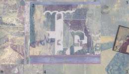 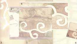 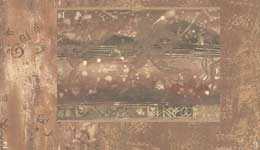 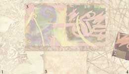 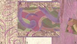 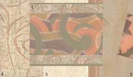
Unfortunately, these papers are no longer available. Ah well. Thanks again to Mr. Cousineau, we've had a fascinating glimpse into a rare curio of Cirque-licensed merchandise history! Our thanks go to Mr. Cousineau for graciously sharing his time with us, and Sabrina Levine of Lizzie Grubman Public Relations in NYC for putting us in touch. |