| |
Michael-Thomas Poulin.
You might not recognize the name but you've seen the work, even if you
don't recognize it as his. This month we continue our efforts to
investigate the treasures that lie within classic Cirque du Soleil
programmes by taking a look at Cirque's one time illustrator: Michel-
Thomas Poulin.
Poulin, skilled in design, pencil drawing and painting, studied at the
Universite Laval in Quebec City. Throughout his career he's taught
graphic design and photography. In 1988, collaboration between Poulin
and Cirque produced a series of twenty paintings inspired by the
onstage and backstage antics of Cirque and its performers. These
paintings were exhibited in Los Angeles and Montreal. But it isn't
his teaching skill, nor his studies at the Universite that interest
me; it's what he's created for Cirque.
At the age of 30, Poulin put his background in graphic arts and silk-
screening to work for Cirque du Soleil, then an upstart circus that
was a collection of street performers who came together to put on a
show. His affair with Cirque began in 1985, when he created the
standard poster for that year's tour, and it continued through to 1994
with Alegría's tour. Michel-Thomas Poulin may not be a household name,
or even be recognized by Cirque fans, but he has arguably created some
of the most recognizable Cirque du Soleil images and illustrations to
date. Let's explore them!
"Le Chapeau Vert"
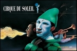 Simply known as "The Green Hat," this illustration was created in 1985
and became the standard poster for that year's tour of Cirque du
Soleil in Quebec. Like its name, the illustration features as its main
image an artist with a red nose and a white-painted face wearing a
green hat, that I must say is similar in style and shape to Peter
Pan's hat! To the left is another breathing fire; that I assume is to
illustrate Guy Laliberte's Fire Breathing Act. Joining these artists
is a woman walking across a tightrope on her tiptoes using a blue
umbrella for balance, and a set of musicians. The image was featured
in various places - as a poster, a button and the front/back cover
images of the 1985 tour programme.
Simply known as "The Green Hat," this illustration was created in 1985
and became the standard poster for that year's tour of Cirque du
Soleil in Quebec. Like its name, the illustration features as its main
image an artist with a red nose and a white-painted face wearing a
green hat, that I must say is similar in style and shape to Peter
Pan's hat! To the left is another breathing fire; that I assume is to
illustrate Guy Laliberte's Fire Breathing Act. Joining these artists
is a woman walking across a tightrope on her tiptoes using a blue
umbrella for balance, and a set of musicians. The image was featured
in various places - as a poster, a button and the front/back cover
images of the 1985 tour programme.
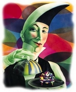
"Boule de Cristal"
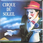 The "Le Magie Continue" tour is captured in color by a presentation
named "Crystal Ball." This illustration appeared as the standard
poster for the 1986 tour, yet, it did not appear as the cover of its
programme. The "Crystal Ball" painting features the likeness of clown
Ben La Barouette in his trademark red hat holding out his left hand as
if beckoning us to come see the show. Hovering just above his left
hand is a small blue crystal ball, which is featured throughout the
tour, if only briefly. Ben La Barouette is set against a dark
background of blues and whites with a blue and yellow stripped big top
of Cirque du Soleil far off in the distance (in the lower left of the
image).
The "Le Magie Continue" tour is captured in color by a presentation
named "Crystal Ball." This illustration appeared as the standard
poster for the 1986 tour, yet, it did not appear as the cover of its
programme. The "Crystal Ball" painting features the likeness of clown
Ben La Barouette in his trademark red hat holding out his left hand as
if beckoning us to come see the show. Hovering just above his left
hand is a small blue crystal ball, which is featured throughout the
tour, if only briefly. Ben La Barouette is set against a dark
background of blues and whites with a blue and yellow stripped big top
of Cirque du Soleil far off in the distance (in the lower left of the
image).
"Le Roi des Fous"
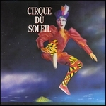 The "King of Fools" graces the standard poster of the 1987 tour.
Sometimes referred to simply as the "Jester," this painting is
probably the most recognizable of all classic Cirque posters. It
features a rendition of the King of Fools character from Le Cirque
Reinvente clad in one of Michel Crete's multicolored costumes. The
character is rendered as if the artist just leapt in the air! The
image is dominated by a darkened sky with the blue and yellow striped
big top off in the distance, in the lower left of the image (in fact,
this is roughly the same image and placement of the big top that
appeared on the 1986 tour poster.) The "King of Fools" illustration
could be seen on a variety of items throughout the tour, from buttons
to hats to stationary, but you'll also find it as the cover of the
original VHS and Laserdisc releases of "We Reinvent the Circus" and on
the original 1987 CD from NAGA Productions. It never officially became
the programme cover for the US Tour; however, it did appear as the
standard image for "Fascination," the 6-month special tour that
combined Reinvente with Nouvelle Experience for Japanese audiences in
1992.
The "King of Fools" graces the standard poster of the 1987 tour.
Sometimes referred to simply as the "Jester," this painting is
probably the most recognizable of all classic Cirque posters. It
features a rendition of the King of Fools character from Le Cirque
Reinvente clad in one of Michel Crete's multicolored costumes. The
character is rendered as if the artist just leapt in the air! The
image is dominated by a darkened sky with the blue and yellow striped
big top off in the distance, in the lower left of the image (in fact,
this is roughly the same image and placement of the big top that
appeared on the 1986 tour poster.) The "King of Fools" illustration
could be seen on a variety of items throughout the tour, from buttons
to hats to stationary, but you'll also find it as the cover of the
original VHS and Laserdisc releases of "We Reinvent the Circus" and on
the original 1987 CD from NAGA Productions. It never officially became
the programme cover for the US Tour; however, it did appear as the
standard image for "Fascination," the 6-month special tour that
combined Reinvente with Nouvelle Experience for Japanese audiences in
1992.
"Éléphant"
 An illustration, called "Éléphant, appeared on the 1987 tour programme
and at first glance it has absolutely nothing to do with elephants, or
Cirque du Soleil. But after taking another look one finds that the
background image is indeed a poster that represents a series of images
from a more traditional circus, which includes elephants. The
foreground, however, is an energetic looking clown dressed in a white
suit with his face covered in white and yellow paint. Putting the two
together wouldn't seem to make much sense but what is actually
happening in the image is relatively simple: the clown of the new
circus is bursting through the poster of the traditional circus and
thus creating a wonderful image of what Cirque du Soleil is all about.
You'll find this image on the 1987 programme.
An illustration, called "Éléphant, appeared on the 1987 tour programme
and at first glance it has absolutely nothing to do with elephants, or
Cirque du Soleil. But after taking another look one finds that the
background image is indeed a poster that represents a series of images
from a more traditional circus, which includes elephants. The
foreground, however, is an energetic looking clown dressed in a white
suit with his face covered in white and yellow paint. Putting the two
together wouldn't seem to make much sense but what is actually
happening in the image is relatively simple: the clown of the new
circus is bursting through the poster of the traditional circus and
thus creating a wonderful image of what Cirque du Soleil is all about.
You'll find this image on the 1987 programme.
"Nouvelle Experience"
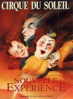 The 1990s brought Cirque into a new realm with a show that was
destined to push the realm of circus arts and theatrical presentation.
The illustration features images of clowns of all shapes and sizes;
many of them you'll recognize as representations of the Flounes,
Madame Corporation and Le Grand Chambellan. For the longest time I
couldn't understand why the image is blurred the way it is - artistic
license? In fact, while artistic license is part of the solution, my
eyes (and thus yours) haven't been able to see the full poster Poulin
created in many years. The full poster not only features the blurred
images of the mentioned characters but the device used to illustrate
WHY they're blurred to begin with - they're in motion! The full image
features at its bottom left a fiery yellow-orange sun (representing
Cirque du Soleil) with the artists rocketing from the brilliance of
the sun at breakneck speed. This is seen when you open one of these
old programmes; the point-of-view of the original poster is more or
less head-on with the four characters speeding away from the sun. The
original poster image made its way onto the 1990 programme for
Nouvelle Experience. The cropped image, however, has been seen on all
other merchandise to date - including the CD, original VHS, and the
1991 and 1992 (at the Mirage) programmes.
The 1990s brought Cirque into a new realm with a show that was
destined to push the realm of circus arts and theatrical presentation.
The illustration features images of clowns of all shapes and sizes;
many of them you'll recognize as representations of the Flounes,
Madame Corporation and Le Grand Chambellan. For the longest time I
couldn't understand why the image is blurred the way it is - artistic
license? In fact, while artistic license is part of the solution, my
eyes (and thus yours) haven't been able to see the full poster Poulin
created in many years. The full poster not only features the blurred
images of the mentioned characters but the device used to illustrate
WHY they're blurred to begin with - they're in motion! The full image
features at its bottom left a fiery yellow-orange sun (representing
Cirque du Soleil) with the artists rocketing from the brilliance of
the sun at breakneck speed. This is seen when you open one of these
old programmes; the point-of-view of the original poster is more or
less head-on with the four characters speeding away from the sun. The
original poster image made its way onto the 1990 programme for
Nouvelle Experience. The cropped image, however, has been seen on all
other merchandise to date - including the CD, original VHS, and the
1991 and 1992 (at the Mirage) programmes.
"Saltimbanco"
 Michael-Thomas Poulin attended some of the very first rehearsals and
meetings, which he used as inspiration to create six different
illustrations. In 1992, he signed the colorful poster that serves as
Saltimbanco's figurehead - the Cavalier, which is inspired by the
rosace in Michel Crete's set design. Saltimbanco's rosette is a
colorful disk that appears as the design for the floor space as well
as the relief that appears overhead. The final version, which we now
enjoy today, was created using acrylic inks and crayons and featured
the famous big yellow and blue big top and the remote-controlled
chair. Poulin also provided other colorful images of the many
characters seen throughout the show. These illustrations were
sprinkled within the 1992 and 1993 programmes of the show. The image
of Saltimbanco has changed slightly through the years to a poster
design that is all yellow, but it still features the famous
illustration by Poulin.
Michael-Thomas Poulin attended some of the very first rehearsals and
meetings, which he used as inspiration to create six different
illustrations. In 1992, he signed the colorful poster that serves as
Saltimbanco's figurehead - the Cavalier, which is inspired by the
rosace in Michel Crete's set design. Saltimbanco's rosette is a
colorful disk that appears as the design for the floor space as well
as the relief that appears overhead. The final version, which we now
enjoy today, was created using acrylic inks and crayons and featured
the famous big yellow and blue big top and the remote-controlled
chair. Poulin also provided other colorful images of the many
characters seen throughout the show. These illustrations were
sprinkled within the 1992 and 1993 programmes of the show. The image
of Saltimbanco has changed slightly through the years to a poster
design that is all yellow, but it still features the famous
illustration by Poulin.
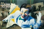
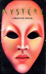
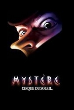
"Chambellan, Jr"
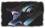 For Mystčre, Mr. Poulin is credited with multiple designs. The first
is the original pink mask that adorned both the programme and T-shirt
designs from 1993 to about 1996. This mask is reminiscent of the
Asticot characters, the Chinese Poles artists, who are double-faced.
This image also appears on the original Mystčre studio CD that was
released in 1994. The second design also appeared about the same time
the double-face mask was used, it is referred to as "Chambellan, Jr.".
Chambellan, Jr. exist in two varieties, which I classify by the
direction his nose points. He is a colorful figure adorned in blues,
yellows, greens, and reds. His is somewhat an enigmatic face, unsure
and unknown. His eyes are piercing and bear into our very soul. The
first rendition of this image is seen from 1993 until 1996 and feature
his nose pointed to the right. The second, and most current, rendition
of Chambellan has his nose pointed to the left. He has also gotten a
bit more colorful through the years, but there's still no mistaking
the purpose of this image - it is as mysterious as the show it
represents, and that's what Mystčre is all about.
For Mystčre, Mr. Poulin is credited with multiple designs. The first
is the original pink mask that adorned both the programme and T-shirt
designs from 1993 to about 1996. This mask is reminiscent of the
Asticot characters, the Chinese Poles artists, who are double-faced.
This image also appears on the original Mystčre studio CD that was
released in 1994. The second design also appeared about the same time
the double-face mask was used, it is referred to as "Chambellan, Jr.".
Chambellan, Jr. exist in two varieties, which I classify by the
direction his nose points. He is a colorful figure adorned in blues,
yellows, greens, and reds. His is somewhat an enigmatic face, unsure
and unknown. His eyes are piercing and bear into our very soul. The
first rendition of this image is seen from 1993 until 1996 and feature
his nose pointed to the right. The second, and most current, rendition
of Chambellan has his nose pointed to the left. He has also gotten a
bit more colorful through the years, but there's still no mistaking
the purpose of this image - it is as mysterious as the show it
represents, and that's what Mystčre is all about.
"Alegría"
 Poulin's last work for Cirque du Soleil came in the form of Alegria's
thought-provoking bird-like image. Who can mistake the wonderful image
of a bird in flight. But unlike most birds, this angelic character is
adorned with two human eyes in the center of its wings. It's a simple
design and yet very very complex in meaning. This image has appeared
on everything associated with Alegría from its original CD to its
programmes. Only recently, like Saltimbanco before it, has Alegría's
standard image changed to incorporate a new feature that only serves
to enhance the overall image. To me, the cream colored "floor" on
which the Alegría mask rests on reminds me of a white sandy beach, and
the first image that comes to mind when I see it is Alegría at Beau
Rivage. But, did you know the image predates the 2000 release? I have
been able to track the illustration as far back as 1996, as it
appeared as the template for a 500-piece puzzle released for the show
in Hong Kong. Today, you'll find this new illustration everywhere -
including the new programme, CD, and VHS/DVD of the show. It has
officially become the 2002 tour poster and more important, the new
image of Alegría.
Poulin's last work for Cirque du Soleil came in the form of Alegria's
thought-provoking bird-like image. Who can mistake the wonderful image
of a bird in flight. But unlike most birds, this angelic character is
adorned with two human eyes in the center of its wings. It's a simple
design and yet very very complex in meaning. This image has appeared
on everything associated with Alegría from its original CD to its
programmes. Only recently, like Saltimbanco before it, has Alegría's
standard image changed to incorporate a new feature that only serves
to enhance the overall image. To me, the cream colored "floor" on
which the Alegría mask rests on reminds me of a white sandy beach, and
the first image that comes to mind when I see it is Alegría at Beau
Rivage. But, did you know the image predates the 2000 release? I have
been able to track the illustration as far back as 1996, as it
appeared as the template for a 500-piece puzzle released for the show
in Hong Kong. Today, you'll find this new illustration everywhere -
including the new programme, CD, and VHS/DVD of the show. It has
officially become the 2002 tour poster and more important, the new
image of Alegría.
Beyond Cirque
After Alegría, Michel-Thomas Poulin and Cirque du Soleil parted ways,
but he's turned up over the years to illustrate some art for three
albums that are non-Cirque related:
"Intuition" by Francois Carrier, a 1998 release where Poulin
worked on the paintings that appeared in the CDs booklet.
Interestingly enough, the Bass player on the album, Pierre Côté,
appeared on the Cirque albums for Quidam and Alegria: Le Film. "La Musique de mon disque" by Pierre Tanguay ("The Music of my
Disc"), a 2000 release that is described as "Heavy New Age"
music. UPC: 771028107926 "Plinc! Plonc!" by Jean Derome, Pierre Tanguay ("Live aux
Soirées de musique fraîche de Québec"), a 2001 release featuring
live renditions of the music of Quebec. UPC: 771028109228
It is safe to say that Michel-Thomas Poulin's legacy with Cirque du
Soleil is secured. He has created some of the most striking artwork
for Cirque, most of which is still seen today! Not bad for a boy from
Sherebrooke (Quebec) who put the finishing stroke on his first
painting by age 12.
And, for the record, Quidam and "O" were illustrated by François
Chartier, La Nouba by Graphčme Communication-Design (photo
manipulation), Dralion by Heďdi Taillefer and Varekai by Michael Dalpé
(photo manipulation).
|
|